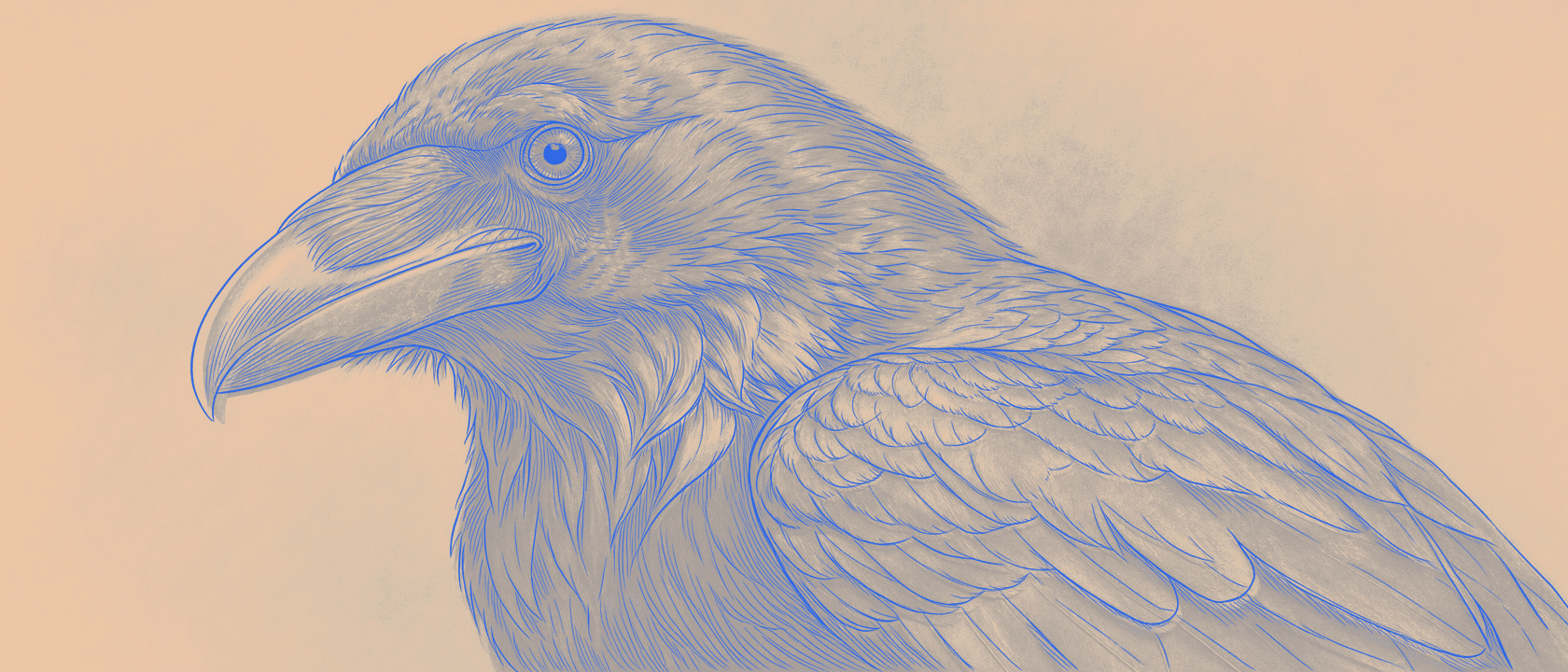
You checked the stencil before you printed it. The lines looked solid. Black on black on your screen, clean and dark, exactly what you drew. Then the thermal print came out, and a few of the finer lines are faint, a couple of them are barely there, and the detail you were counting on is just gone.
Nothing was wrong with your prep. Nothing was wrong with the paper. The lines were never as black as they looked.
Drag the handle, or let it sweep, and watch a rich, dark source become a stencil built to print: true black where it counts, every fine line kept.
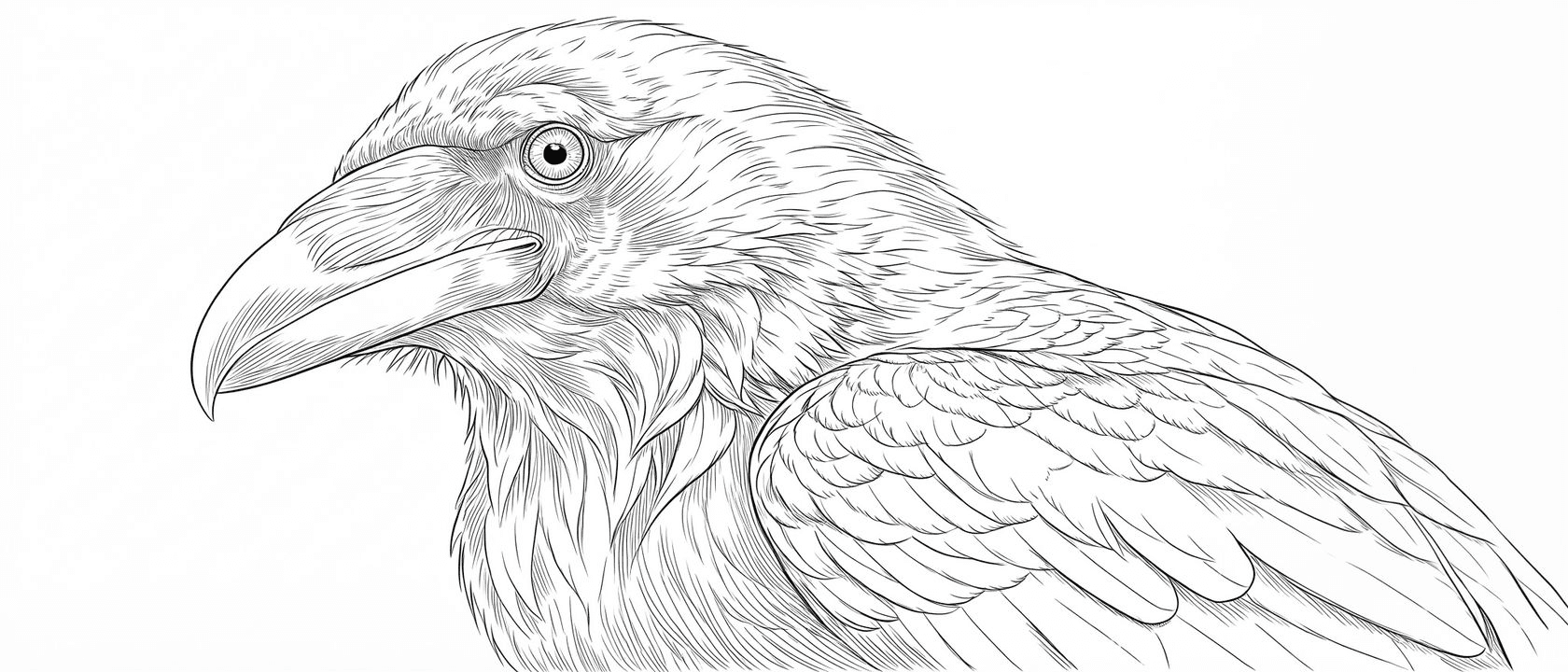
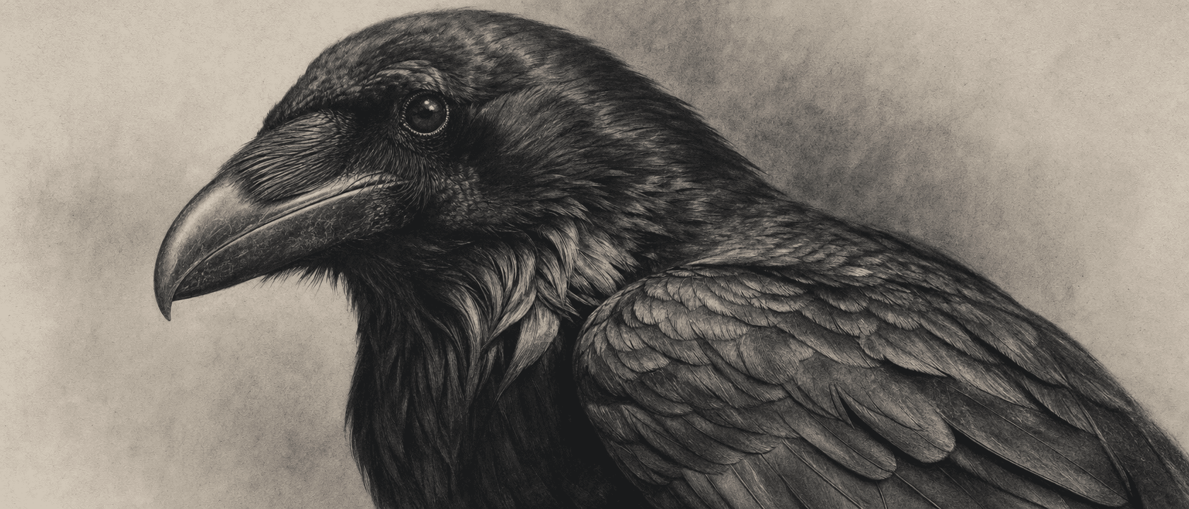
"Almost black" and "black" look the same to you. Not to the printer.
We went deep on why this happens in an earlier post on why stencils won't transfer. The short version: a thermal printer can't render grey. It burns solid where the image is dark enough to cross a threshold, and it does nothing where it isn't. There's no in between.
Here's the part that makes it sneaky. Your eye is generous. A line that's 85% black and a line that's 100% black look identical on a backlit screen. You can't tell them apart, so you sign off on the file. The printer isn't generous. It measures. A line sitting just under its threshold gets dropped to faint, or dropped entirely, while the line right next to it prints solid. That's what makes the failure so maddening. It's invisible until it's on the paper.
The thinner the line, the harder it bites. Hairlines and fine detail carry the least ink to begin with, so they're the first thing to fall off the second the black isn't fully committed.
You told us, and we shipped it
This was the single most common thing artists kept flagging. Not "make my lines thicker." Not "change the style." Just: my detail looks right on screen and comes out weak on the print, and I can't tell in advance which lines are going to make it.
So we fixed it at the source.
Every stencil Line Ripper generates now has its blacks amplified automatically. We take the ink that's sitting at almost-black, the values your eye reads as black but the printer reads as a maybe, and we push it to true black before you ever download the file. What was going to print faint now prints solid. You don't toggle anything. You don't check a box. Every stencil, every time.

Amplified, not fattened
Here's what we did not do, and it's the whole trick.
The lazy way to make everything print is to crank the contrast and thicken every line into something a printer can't miss. That's what most generic converters do, and it quietly wrecks your work. Your fine-line passages come back chunky, your weights all flatten to one, and the stencil isn't your drawing anymore.
We don't touch your line weight. Line weight stays yours to control, and amplifying the blacks doesn't cost you a single hairline. A thin line stays exactly as thin as you drew it. We only change how dark a line is, not how wide. The soft edge that keeps a line looking crisp instead of jagged stays intact, so nothing turns blocky. The line goes from almost-black to black and keeps its shape.
That's the difference between a stencil that prints your detail and one that survives by steamrolling it.

The detail you can barely see is the detail that matters
The reason this landed as a real request and not a nice-to-have is that the lines most likely to be slightly-off-black are usually the ones doing the most delicate work. The wisp at the end of a feather. The inner strokes of ornamental filigree. The fine texture inside a fill. Exactly the stuff that separates a piece that reads as finished from one that reads as rushed.
When those lines drop out on the transfer, you either catch it mid-session and freehand them back, or you don't catch it and the piece is quietly missing its finish. Amplifying the blacks means the delicate detail arrives on the skin the way it left your screen.
Color stencils get the same treatment. When you export a red stencil, the red is pushed to a deeper tone that prints cleanly, while the preview on screen keeps the vivid red you picked. Same idea. What you see and what prints finally agree.
You still do your half
None of this retires the bench craft. Shave close, clean the skin, let it dry, thin even layer of gel, peel slow, keep your wiping off it once you start. That half is real and it's yours.
What's changed is that the file half is handled before it reaches you. You're no longer squinting at a screen, trying to guess which almost-black line is going to betray you on the paper. The blacks are black. The detail is there. Do your prep the way you always have, and the stencil stops fighting you.
Your art, your way. Just faster. Now with blacks that actually make it onto the skin.