
Every stencil tool on the internet makes the same promise. Upload any photo, get a clean tattoo stencil in seconds. Any photo. That word is doing a lot of quiet lying.
Because the photo you feed in decides almost everything about what comes out. A converter, even one trained specifically for tattoo work, can only pull line work from the contrast that's actually in the file. Hand it a clean, well-lit reference and you get crisp, transfer-ready lines. Hand it a dim phone snap of a dim phone screen and no amount of clever processing invents the detail that was never captured.
Nobody talks about this half. There are a hundred guides on how to run the tool and none on how to pick what you run through it. So that's where we're going: how to choose a reference photo that actually stencils, before you ever hit generate.
First, the target. Drag the handle, or let it sweep, to watch a strong reference become a transfer-ready stencil with the line weights kept where they belong.
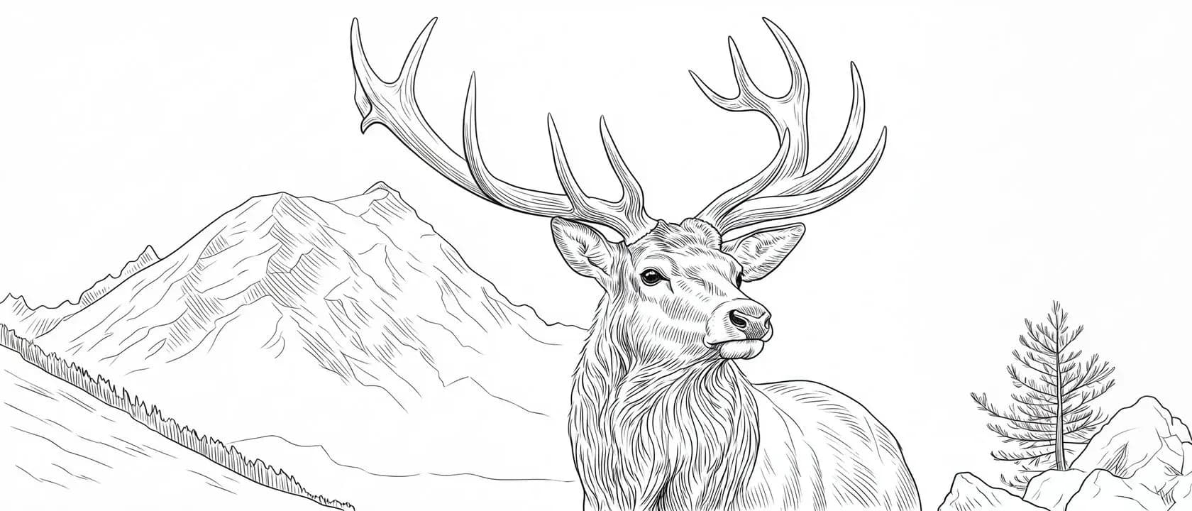
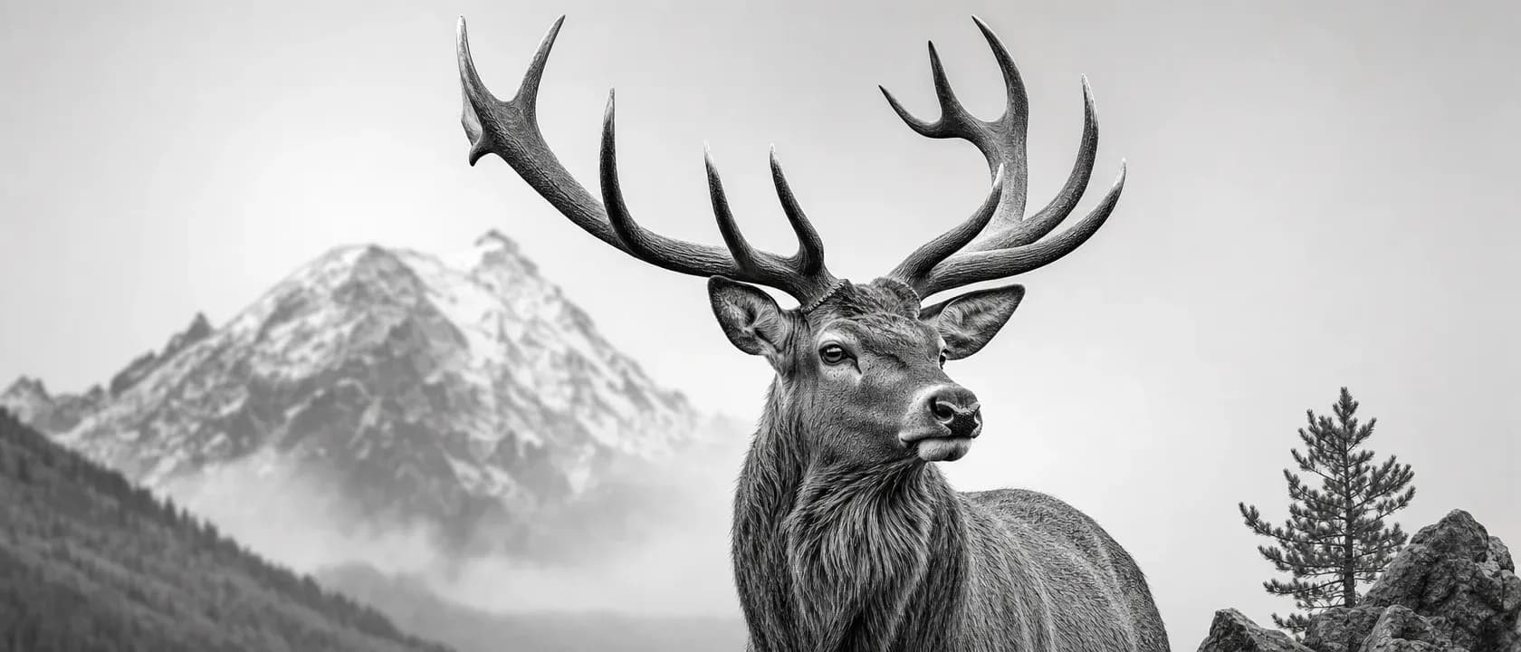
The reference decides the stencil
Here's the uncomfortable truth. The generator is only as good as the darkness it can find.
A thermal stencil printer can't read grey, so a good stencil is built from committed blacks and clean edges. We went deep on that physics in why your stencil won't transfer, and it's worth reading if you've ever laid a transfer that came up faint. The short version: the printer burns solid where the image is dark enough and does nothing where it isn't.
Now walk it back a step. That true-black line has to come from somewhere. If your reference has real separation between the subject and the background, real contrast between light and shadow, the tool has clear edges to trace and turn solid. If your reference is a soft grey wash with no committed darks anywhere, there are no edges to find. The stencil comes out tentative because the source was tentative. Garbage in, faint transfer out.
This isn't a knock on any tool. It's the ceiling every one of them shares, and the fastest way to raise your results is to stop fighting it and start feeding it better.
What a good reference actually has
Four things, and you can check all of them before you upload.
Real contrast. The single biggest lever. You want a clear gap between the darkest and lightest parts of the subject. Squint at the photo. If the whole thing collapses into one muddy middle-grey when you squint, there's nothing for the tool to grab. If the shapes still read, you're in business.
Flat, even light. Counterintuitive, but dramatic single-source lighting is usually the wrong reference for a stencil. Hard raking shadow looks moody to your eye and hides half the subject from the converter. Even, diffuse light (an overcast day, a shaded window, a softbox) shows the whole form and gives clean, findable edges instead of black voids where the detail used to be.
Sharp focus and enough resolution. The tool traces edges, so the edges have to exist. A crisp, in-focus photo at a decent size hands it clean boundaries. A blurry or heavily compressed image (a screenshot of a screenshot, a tiny thumbnail blown up) smears those boundaries into mush before you ever start.
A subject that stands out from its background. A clear subject against a plain or simple ground converts cleanly. A subject lost in a busy, cluttered scene forces the tool to guess what you care about, and it will trace the fence behind the dog with the same confidence it traces the dog.

What quietly wrecks one
The failure references are just as consistent, and most of them are fixable by picking a different shot.
Blown-out highlights. When the bright side of the subject is pure white with no detail, that detail is gone for good. The tool can't recover what the camera clipped. Faces washed out by flash and sunlit surfaces with no texture left are the usual culprits.
Muddy, low-contrast everything. The opposite problem. A flat, hazy image where nothing is truly dark and nothing is truly light gives the converter no anchor. It's the single most common reason a stencil comes back weak.
Heavy soft shading with no edges. Beautiful gradient rendering, a portrait that's all smooth tonal falloff, reads gorgeously on screen and terribly as a stencil, because a stencil is edges and this has almost none. If your source is more airbrush than ink, expect the tool to have to invent structure that isn't there.
Too small. A 400-pixel image found on a search result page does not become a detailed back piece. Start bigger than you think you need. You can always throw resolution away; you can't add it back.
Give the line-weight slider something to work with
Here's the payoff for getting the input right. A clean, high-contrast reference is what lets the rest of the controls do their job.
When the source has real edges, line weight control has actual lines to thin or thicken, so you can push toward delicate fine-line work or bold traditional weight and trust the result. And the automatic true-black step that pushes every stencil's darks to full solid has committed darks to amplify instead of a grey guess. Feed the tool clean input and every downstream control gets sharper. Feed it mush and you're asking three good features to rescue a file that never had the information in it.
That's the whole relationship. The tool does the ripping. The reference is your half of the deal.
The afternoon checklist
Next time you're about to convert a photo, run it past this first. Every one of these is something you can eyeball in ten seconds.
- Squint at it. Do the shapes still read, or does it all go muddy grey? Muddy means skip it.
- Check the light. Even and diffuse beats hard and dramatic for line extraction.
- Check for blown highlights. Is the bright side pure featureless white? That detail won't come back.
- Check the focus. Crisp edges convert; blurry ones smear.
- Check the size. Bigger than a thumbnail. Start high-res, always.
- Check the background. Does the subject clearly stand apart, or is it lost in clutter?
- Prefer a real photo or a clean drawing over a screenshot, a re-saved meme, or a compressed re-share.
Pick the reference that passes, and the tool has an easy job. Pick the one that fails, and no converter on earth saves it. The best thing you can do for your stencil happens before you upload it.
Line Ripper runs in your browser, on any device, nothing to install. Bring a strong reference and rip it clean.